

Last month’s enews introduced drones and their main uses in broadacre cropping. This month, we compare drones to satellites and yield monitors/yield maps to illustrate some major differences in how they work and what they show.

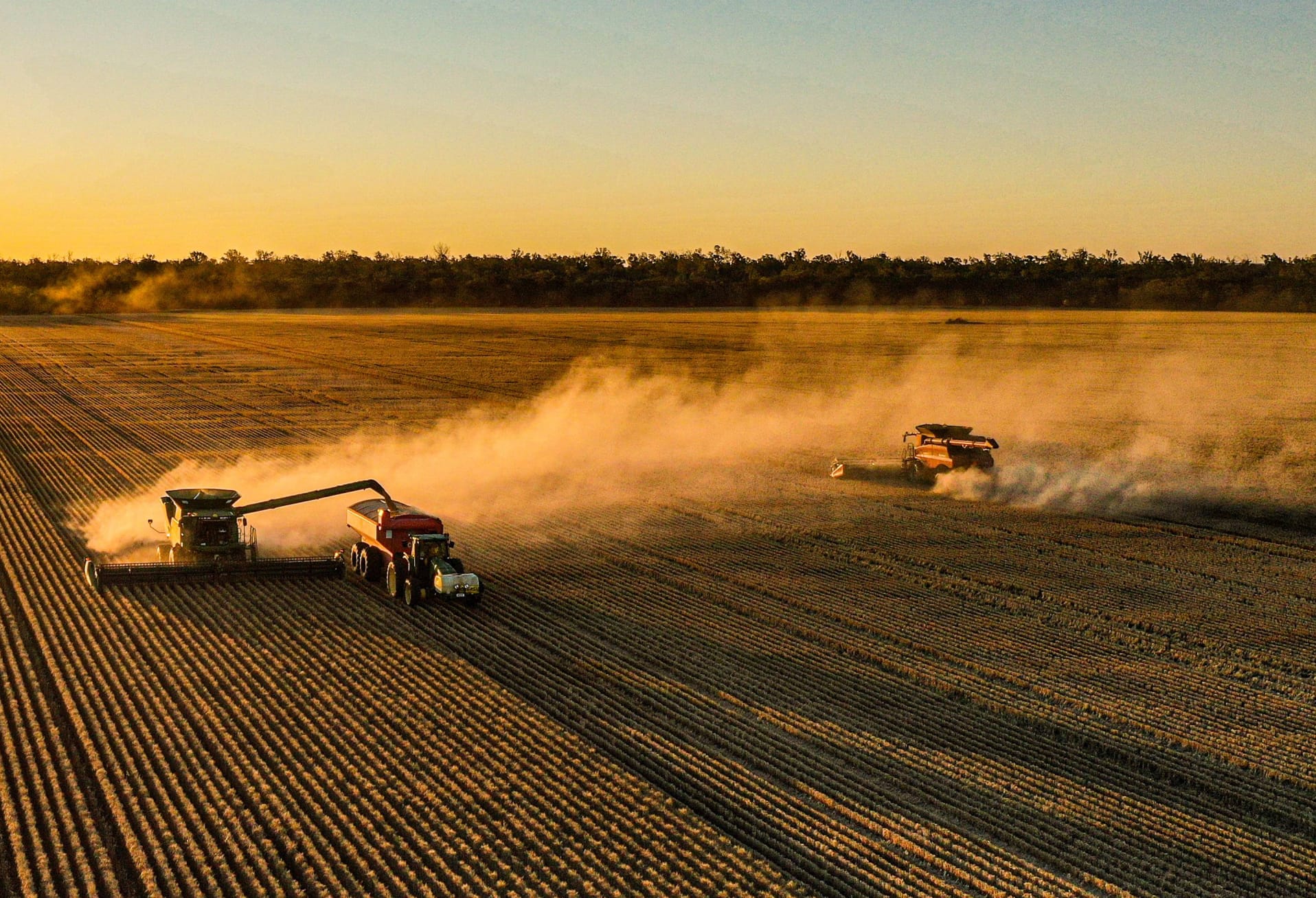
Yield monitors measure grain flow into the tank and link this with GPS coordinates as the header moves across the paddock to generate a yield map. Yield maps might be the most well-known type of precision agriculture imagery, but few people actually use them. In a survey conducted at BCG’s recent 2016 trials review day, 72% of members had yield mapping on their header, but only 51% actually took them off the harvester and only 20% actually used them for nutrition decision making.
Satellite imagery has been around for years, and is now easily available from a range of sources. When it comes to broadacre cropping, the most commonly used satellite data is also based on NDVI imagery from multispectral sensors. In this sense, satellites offer a very similar range of imagery and potential insight as drones, but have a number of key practical differences that can influence which one is best for a given application.
Timing and availability
Yield maps are only available at harvest, whereas drone and satellite imagery can be collected at multiple points over the season. In this sense, yield maps are a vision of what has happened, whereas drones and satellites can tell you what is happening as the season progresses.
Knowing what has happened is obviously very useful, and has the benefit of directly reflecting yield rather than presenting a related indicator. However, this knowledge can only be used for decision making in the next season, and there will likely be a lag between when the data is collected (i.e. at harvest) and when action is taken (e.g. spreading). This introduces a time gap where new factors can affect potential outcomes.
On the other hand, drones and satellite offer imagery that is much more current. Satellite imagery is available whenever the satellite passes overhead, which can be quite frequent. For example, in 2016 BCG accessed satellite imagery using the watch.farm service, which aimed to provide an image 4-5 times per month. Drone imagery is available whenever you like, provided that you have access to a drone or contractor and that the weather isn’t too bad for flying. Because of this, both sources can provide valuable additional insight to add to yield maps.
Quality and resolution
A high quality yield map relies on good calibration. Even with good calibration, error can creep in as a result of GPS issues, blockages, or changes in speed as the header travels across the paddock. This means that a ‘raw’ yield map straight off the header may need to be cleansed of incorrect values before it can be relied on for decision making. The resolution of a yield map will depend on the width of the header front.
Drones offer high resolution and, generally speaking, high quality imagery – although this will depend on the drone, sensor, operator, and weather conditions. The drone used by BCG can collect imagery up to 1.5cm resolution. Satellites are often lower resolution and are affected by clouds. Commonly used, low-cost satellite imagery will vary between 10m and 30m resolution, although high resolution satellite imagery is available for a higher price.
Because of the higher resolution, and the ability to collect data as needed, BCG found the drone more useful for crop scouting and monitoring test strips in 2016. The lower resolution satellite data, combined with less accurate georeferencing (~15m accuracy), often made it impossible to distinguish individual strips. However, the satellite data was very useful for monitoring what was going on in general in the paddock over the season with very little effort, and observe larger-scale trends and issues.
Convenience and cost
Yield monitors do require calibration before harvest, but the actual data collection process is automatic. Often, the most difficult part of the process is getting the yield maps off the header – which may explain why so few people do so!
Satellite data is similarly hands-off but is generally very easy to access. For example, watch.farm only required paddock boundaries to be defined at the start of the season using an online tool, and then images were received via email whenever it became available. However, cloud cover during the 2016 growing season meant that there was often no usable data when the satellite passed over. In some cases, no useful imagery was received for several weeks, and what imagery was available did not necessarily coincide with key events or growth stages. Satellite imagery is generally very cheap: BCG has previously paid 35c/ha for low resolution data, but higher resolution satellites can cost significantly more.
In comparison, drones have a steeper learning curve and require more effort to collect data. Drones dhave limited battery life, may crash, be threatened by birds, and are subject to a number of legal restrictions. However, flights can be scheduled on demand to match key events or growth stages, and can work around periods of bad weather to ensure that data is collected when needed. Drone prices were discussed in the previous article, and drone contractors may charge anywhere from $3 to $15/ha.
The bottom line
Yield monitors, drones and satellites all have different strengths. Yield maps provide great insight at one point in time. Drones and satellites offer the ability to monitor what is going on more frequently, with very different forms of convenience: the convenience of hands-off, risk-free data with the satellite, versus the convenience of on-demand, customisable, high resolution data collection with the drone.
What kind of imagery is best for the job depends on exactly what you’re trying to do – and a combination of different types of imagery might ultimately give better insight than trying to rely on a single source of information.